Elephant Chart - AVC
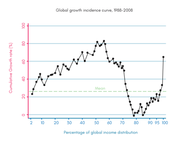
I came across this chart today. Maybe all of you have seen it, but I hadn’t. It is called “the elephant chart” because the shape of the chart looks like an elephant. It was create...
Source: AVC
I came across this chart today. Maybe all of you have seen it, but I hadn’t. It is called “the elephant chart” because the shape of the chart looks like an elephant. It was created by Christoph Lakner and Bruno Milanovic for their book, Global Inequality: A New Approach for the Age of Globalization. It charts the change […]